
A search engine for public mental health services
A case study of a potential application and website for a public mental health services search engine.
This project is a result of the Google UX Design Professional Certificate course and aimed to build a search service specifically for public mental health services and institutions. As a psychologist who graduated from a public university and was an intern for over 2 years at such an institution, this project has a very powerful dimension for me personally. The dissemination of information about such services, the differences between them and their access are great challenges for professionals in the area and for potential users who so need some support in times of so much psychological suffering like ours.
Problem
In my local community, there are good mental health institutions and public services, but they are not very well known. Even so, they are often overwhelmed or full. In short, they are difficult to access.
Objective
Design a multiplatform tool to find and obtain information about local mental health institutions and public services.
My role
In this project, I performed and led all the functions of the process in 5 UX phases: 1. Empathize ; 2. Define ; 3. Ideate ; 4. Prototype ; and 5. Test .
1 . User research, personas, user journeys;
2 . Problem statements and hypothesis statements;
3 . Brainstorming and storyboarding;
4 . Lo-fi/Hi-fi prototypes, wireframing and mockups;
5 . Usability studies and insights.
Questions:
Do potential users have access to information about public mental health services?
How can we make better access to information about public mental health services possible?
How would users interact with public service search engines? What do they expect?
Does the search engine perform essential functions in a simple and intuitive way?
Firstly,
research
Understanding and learning about and from users, "empathizing" with them, is truly the heart and soul of the UX area, as well as a fundamental step in a case study and in research. In this project, bringing together my experience of 2 and a half years as an intern in a public mental health service, I conducted interviews with potential users with the aim of learning from them, through the methods of empathy maps , personas and user journeys . As this was an embryonic project, with time and budget limits, 5 participants aged 18 to 60, 2 men and 3 women, randomly selected in front of public mental health services, were interviewed.
This first round of research was important to provide an overview of the situation. For example, the difficulty in accessing information about public health services . In this first phase, the focus was on listening to fundamental problems and demands (P0) that could be addressed with a first basic design proposal, as will be detailed below.
Questions asked in the interview:
1
When you think of "mental health services", what comes to mind?
2
What do you know about public mental health services?
3
How would you describe your past experience with public mental health services (or public health in general)? What were your biggest challenges?
4
When you need information about mental health and mental health services, where do you turn? What is your experience like?
5
How would you say your experience as a public health user could be improved?
Meet two users
In this presentation, the focus will be on Hugo, one of the personas created based on the preliminary interviews, and the questions raised by his story.
Empathy maps originated as a synthesis of research


Personas created later
![2. Persona [P3] (1).png](https://static.wixstatic.com/media/f64809_fa96c1d4121d4e1393d222b267b4782a~mv2.png/v1/crop/x_14,y_0,w_932,h_540/fill/w_499,h_289,al_c,q_85,usm_0.66_1.00_0.01,enc_avif,quality_auto/2_%20Persona%20%5BP3%5D%20(1).png)
![2. Persona [P3].png](https://static.wixstatic.com/media/f64809_acfc50fb99b74fafb5674c53fac8a1b6~mv2.png/v1/crop/x_10,y_0,w_940,h_540/fill/w_503,h_289,al_c,q_85,usm_0.66_1.00_0.01,enc_avif,quality_auto/2_%20Persona%20%5BP3%5D.png)
Top user pain points revealed
1
Information
The lack of information about the existence, location and availability of public mental health services was predominant. Participants reported difficulty in accessing information.
2
Navigation
Navigating public service information in general also emerged as something lacking. According to participants, their websites are confusing and difficult to navigate.
3
Vacancies
Many public mental health services operate with limited vacancies and the lack of publicity regarding when new vacancies are available was also mentioned.
Benchmark : research with competitors
A survey was conducted with three search/map services as a way to map both the strengths, saving research work for this project with users, and the weaknesses, exploring possible spaces for innovation. The spreadsheet presenting the results is in this link . Two companies that provide general search services were surveyed, as well as a specific search application for public transport lines.
Preparing the
journey
After the initial research, analysis of results and definition of the central issues, the challenge was to start idealizing solutions for the problems that had emerged . This was the part where imagination was challenged and the fundamental rule was: let the ideas flow . Ideas that were initially considered bad or even silly can eventually change the course of a project, so it is important to raise the filters as much as possible when thinking about solutions.
In this project, the main ways of channeling this flow of ideas were through the development of user problems , hypotheses and solution proposals , storyboards , sitemaps and wireframes (paper and digital). Below are some of these elements.
Proposals based on the first survey
As this is a preliminary development project, i.e. a design made from scratch, two sections were chosen, based on the research data, as focus and effort delimiters:
1. Building an intuitive flow and optimized public mental health institution search through the map format.
2. Two proposals to help users know when institutions open up job openings : "saving" institutions, and notifications.
The approach is also important, since this project encompasses both an app and a responsive web version. The progressive enhancement approach was chosen , which consists of focusing on the mobile screen and expanding the design to larger screen sizes. Since this is a search engine that would reach people in less privileged financial conditions, the idea is to prioritize the mobile phone, since it is more accessible. It is also worth mentioning here that the search engine will be translated into Portuguese in the prototype and in the final version .
Other opportunities were also identified , but were not prioritized at this time. If this case study were a professional project contracted, these would be some of my suggestions for future development:
1. Creating a personal account and synchronizing between app and website.
2. Appointments via the app and website.
3. Teleservice via the platform.
Problem and a solution hypothesis
![Problem Statement [P3].png](https://static.wixstatic.com/media/f64809_7ad9582e73d64858b8d1b1fe2aa55709~mv2.png/v1/crop/x_0,y_0,w_960,h_431/fill/w_528,h_237,al_c,q_85,usm_0.66_1.00_0.01,enc_avif,quality_auto/Problem%20Statement%20%5BP3%5D.png)
Daniel is an unemployed student who needs an easy way to navigate and find public mental health services as he cannot afford private services.
![Problem Statement [P3] (1).png](https://static.wixstatic.com/media/f64809_f60ee453341e4f2e9d7f98ced96f165e~mv2.png/v1/crop/x_0,y_0,w_960,h_447/fill/w_528,h_246,al_c,q_85,usm_0.66_1.00_0.01,enc_avif,quality_auto/Problem%20Statement%20%5BP3%5D%20(1).png)
Sandra is a busy worker who needs to know when there are vacancies at mental health institutions because she always misses out on them when they open up.
![Hypothesis Statement [P3].png](https://static.wixstatic.com/media/f64809_b5d49b212ef446e5b2498479e0a51998~mv2.png/v1/crop/x_0,y_15,w_960,h_408/fill/w_560,h_238,al_c,q_85,usm_0.66_1.00_0.01,enc_avif,quality_auto/Hypothesis%20Statement%20%5BP3%5D.png)
If Daniel could easily navigate the public mental health institutions near him, so he could get treatment.
![Hypothesis Statement [P3] (1).png](https://static.wixstatic.com/media/f64809_ef338836bbdd48f88da1e5d8c7901516~mv2.png/v1/crop/x_0,y_15,w_960,h_422/fill/w_560,h_246,al_c,q_85,usm_0.66_1.00_0.01,enc_avif,quality_auto/Hypothesis%20Statement%20%5BP3%5D%20(1).png)
If Sandra would be alerted when there are vacancies in an institution , so she would be able to do psychotherapy there.
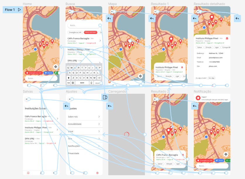
Below, the first version of the user flow assembled from the initial research and the proposals generated by it.
![User flow [P3].png](https://static.wixstatic.com/media/f64809_ae81c42b655847a5918e1620b9de90ec~mv2.png/v1/crop/x_0,y_12,w_960,h_516/fill/w_940,h_505,al_c,q_90,usm_0.66_1.00_0.01,enc_avif,quality_auto/User%20flow%20%5BP3%5D.png)
Some paper wireframes made with the first versions of screen design for the user flow in mind. The idea is to let the imagination flow with the least amount of constraints, so that non-obvious ideas can emerge.

The two main digital wireframes in their early versions.
Home
![Google UX Design Certificate - Portfolio Project 3 - Case study slide deck [Template] (1).](https://static.wixstatic.com/media/f64809_243acdc70714440893c22f5e39b8bb7d~mv2.png/v1/crop/x_335,y_0,w_623,h_540/fill/w_433,h_375,al_c,q_85,usm_0.66_1.00_0.01,enc_avif,quality_auto/Google%20UX%20Design%20Certificate%20-%20Portfolio%20Project%203%20-%20Case%20study%20slide%20deck%20%5BTemplate%5D%20(1)_.png)
Familiar navigability through the map and the ability to save desired institutions.
Resultados
![Google UX Design Certificate - Portfolio Project 3 - Case study slide deck [Template] (2).](https://static.wixstatic.com/media/f64809_d06326128967497f82f47a154883148f~mv2.png/v1/crop/x_337,y_0,w_617,h_540/fill/w_428,h_375,al_c,q_85,usm_0.66_1.00_0.01,enc_avif,quality_auto/Google%20UX%20Design%20Certificate%20-%20Portfolio%20Project%203%20-%20Case%20study%20slide%20deck%20%5BTemplate%5D%20(2)_.png)
Result appears below to continue showing the map with reachability, together with the quick action buttons aim to improve usability.
Digitizing the wireframes using the Figma tool .

And it's time for the first prototype! In this case, a low-fidelity ( lo-fi prototype ) - also made using the Figma tool.
From theory to
practice
With the first prototype finally assembled, we officially moved from the theoretical and idealization stage to something malleable and usable. The prototype inaugurated the new phase in which, initially, a usability test was organized to evaluate the newly assembled base structure of the application. Then, work was done to collect and analyze this data , so that the first structure could be fixed and improved .
After the first usability test, the focus shifted to the UI ( User Interface ) part, as a way to bring the application more to life. To this end, wireframes became muckups and lo -fi became hi-fi prototype . And what do all these acronyms in English mean? That architectural design gave way to the aesthetic part - with colors , typography , iconography , images , animations , etc. Which does not mean, however, that such changes were without foundation. After all, UI is a vast area that I only had the opportunity to merely glimpse.

Usability testing
Usability testing is fundamental to UX and should be constantly organized. In this project, a moderated usability test was conducted with five participants using a low-fidelity prototype ( lo-fi prototype ), which is shown in the last image. Below are the details of the test.
Key Questions
1. Is the navigation simple and pleasant to use?
2. Are there any parts of the navigation that users get stuck on or find confusing?
3. What can be refined and improved?
Participants
5 participants
2 men and 3 women.
Participants aged 18 to 60, residents of the metropolitan region of Rio de Janeiro, BR.
Methodology
Time : About 15 to 20 minutes of browsing and answering questions.
Where : Rio de Janeiro, BR.
Method : Moderated usability testing.
KPI :
User error rates : Investigate potential issues with the design and navigation of the ordering process .
Description : Participants were instructed to complete a task, "search for health service information", in a low-fidelity (lo-fi) prototype, while answering questions.
Test Guidelines and Questions:
1
Looking at the home page, how do you feel?
2
a
Let's say you want to find information about a public health institution, how would you do it? Please describe your thoughts out loud.
How was it? Were there any challenges along the way?
3
Let's say you want to see your institutions saved, how would you do it? Please describe your thoughts out loud.
a
How was it? Were there any challenges along the way?
4
What can you tell me about navigation? Did you get confused at any point?
5
What is your overall opinion of the app? Were there any important points that you thought of?
a
What did you like and dislike about it? Do you have any suggestions?
Affinity diagram:

Findings, the insights , from the test:
Navigation should be less confusing
The navigation was considered a bit confusing at times, so a navigation menu was soon added to the bottom of the design.
Important information needs to be highlighted more
Some key information, such as whether or not there are vacancies, opening hours, and whether or not there is an emergency room, were considered a bit hidden. Therefore, they were added to the search results.
Homepage should have more interaction shortcuts
Some of the most common searches, such as institutions "near me", "with vacancies" and "with emergencies", were added to the first page, aiming to speed up the search for users in need.
Evidence for insights :
![Create a Research Presentation [P3] (4).png](https://static.wixstatic.com/media/f64809_5f45dc0e8ff0466d8abf77097418676d~mv2.png/v1/fill/w_599,h_337,al_c,q_85,usm_0.66_1.00_0.01,enc_avif,quality_auto/Create%20a%20Research%20Presentation%20%5BP3%5D%20(4).png)
![Create a Research Presentation [P3] (1).png](https://static.wixstatic.com/media/f64809_82de6e6865614f5e8cbecc0bd287af7f~mv2.png/v1/fill/w_599,h_337,al_c,q_85,usm_0.66_1.00_0.01,enc_avif,quality_auto/Create%20a%20Research%20Presentation%20%5BP3%5D%20(1).png)
![Create a Research Presentation [P3] (3).png](https://static.wixstatic.com/media/f64809_2b175419fe7e47758c5f8a7ab5841863~mv2.png/v1/fill/w_599,h_337,al_c,q_85,usm_0.66_1.00_0.01,enc_avif,quality_auto/Create%20a%20Research%20Presentation%20%5BP3%5D%20(3).png)
Changes caused by test results:
![Create a Research Presentation [P3] (5).png](https://static.wixstatic.com/media/f64809_e6c16e4f5f2944309d915e64308ce77b~mv2.png/v1/fill/w_599,h_337,al_c,q_85,usm_0.66_1.00_0.01,enc_avif,quality_auto/Create%20a%20Research%20Presentation%20%5BP3%5D%20(5).png)
The menu bar has been added to improve navigability, as well as quick searches to improve usability.
![Create a Research Presentation [P3] (6).png](https://static.wixstatic.com/media/f64809_ad203e192a114bbc9997dfc36c2c3056~mv2.png/v1/fill/w_599,h_337,al_c,q_85,usm_0.66_1.00_0.01,enc_avif,quality_auto/Create%20a%20Research%20Presentation%20%5BP3%5D%20(6).png)
Font and color hierarchy organizes results. Important information has also been added to be viewed at a glance.
![Create a Research Presentation [P3] (7).png](https://static.wixstatic.com/media/f64809_9425038f70df45339b20b44c240be0ed~mv2.png/v1/fill/w_599,h_337,al_c,q_85,usm_0.66_1.00_0.01,enc_avif,quality_auto/Create%20a%20Research%20Presentation%20%5BP3%5D%20(7).png)
Important information added for quick viewing . Simplified navigation by simply swiping sideways.
The choice and design of the UI (user interface):
The map
The map was created using the Snazzy Maps tool .

The colors
The color palette was chosen to match the map and was inspired by competitors analyzed in the benchmark research.
#FF4141
Red is flashy, yet engaging.
#319C3C
Green brings positivity and a break from icons.
#4E87F4
Blue also brings a break to the icons.
#484848
Used as black, it is contrasting but more pleasing to the eye.
#767676
For details and additional information
The choice of typography
The application's typography was based on just one font : Open Sans .

Open Sans .
This choice was based on the source'sfamiliarityandefficiencyin conveying information.
The transition to mockups


And it's time for the second prototype! This time, a high-fidelity one, the hi-fi prototype . From there, page transition animations were added and the "final" refinements were made to the design, as well as the translation into Portuguese.
Responsive : from small to large
As presented in item 2, after this process , and introducing visual and aesthetic elements such as colors, icons, fonts, images (etc.), the approach called progressive enhancement was used in this project because it is a search engine that would cover people in less favored financial conditions, the idea is to prioritize the cell phone, since it is more accessible.
With that, designs were expanded, from smallest to largest, keeping in mind the following fundamental question: " how to take advantage of the largest screens for a better and optimized user experience? "


The mobile web version of the search engine prioritized quick searches even more, thinking about users in quick and emergency use situations.
The web versions for tablets and desktops prioritize and optimize navigation through map exploration .


The result
"end"
It is very interesting to go through so many phases and reach what would be the "end" and realize, in practice, something that is always said in a theoretical way: there is no absolute final version.
Of course, what will be presented next is the last version of the project that I worked on - and if it were a professional project, the base would be sent to the engineering group and the UX cycle would start again.
However, I am talking about another aspect: the feeling of wanting more is evident in the body itself. This feeling is perfectly illustrated in the form of thoughts such as: "let me just improve this a little bit more", "this screen would improve the design", "this shade of red is better than this one" etc. It is a peculiar feeling. The project, when made based on what touches us, is always calling us to "just a little bit more".
The transition from the first wireframes to the "final" muckups . Here, the design was translated into Portuguese, bringing more immersion to the context for which the search engine was made.


High fidelity prototype, the hi-fi prototype
Developed in Figma and available for testing at this link .
[Printout of the prototype]
The two main wireframes presented previously and their new versions in mockups .
The faces of Home


.png)
.png)
.png)
Web version
The Faces of Search


Web version
Next steps:
If this case study were an ongoing product, these would be the next steps stipulated for the project to continue moving forward.
1
Schedule
After a good response with the high-fidelity prototype tests, the project structure would be handed over to the engineers to begin the programming phase.
2
More Research
Additionally, research and usability testing would be continually redone in order to continue refining the design.
3
New functions
As previously stated, new opportunities would be explored, with the aim of offering new services capable of solving users' problems, such as:
1. Creating a personal account and synchronizing between app and website.
2. Appointments via the app and website.
3. Teleservice via the platform
4
A new cycle
Last but not least, the cycle would be restarted with the User Empathy phase, with the aim of understanding new pain points that design could address and produce solutions.
Acessibility:
The Google/Coursera course has been highlighting the importance of always thinking about design with accessibility in mind since the beginning. In the case of this project, some accessibility points that stood out, and that would be addressed in more depth if the project were to continue, were:
1
Language
Since this is an international course, the app design was written in English. However, as a Brazilian developing an app for my local community, translating the low-fidelity prototype and the "final" version of the project into Portuguese was essential .
2
a11y colors
The color palette was chosen with A11y (accessibility) color contrast standards in mind.
3
Reachability
In designs like the app and website homepage, accessibility was considered throughout. For example, with those on the go and experiencing mental health emergencies in mind, the quick search buttons and search bar were placed close to the thumb for one-handed use .
Learnings
As a psychology graduate who interned at a public mental health institution, I find the social impact of access to psychotherapy incredible. One participant and potential user expressed it perfectly: “For me, access to psychotherapy is the foundation of social transformation.”
Throughout this project, I learned to view the pressing mental health crisis we face today from a new perspective. While focusing on community and the importance of empathy for social good, the process of designing a mapping app allowed me to explore this issue through the lens of geographic and urban organization.
As a psychologist and researcher, it was fascinating to apply skills such as listening, empathy, understanding, acceptance, curiosity, logical thinking, and problem-solving to serve others in a field like UX.
Acknowledgements
I would first like to thank the Coursera and Google Education communities for the opportunity to take the Google UX Design Professional Certificate . I would also like to thank the Figma community for the opportunity to use the tool. In addition to these institutions, I would like to thank the research participants, Álan Belém for recommending the Google/Coursera course, and Elisa Leo Oliveira for her great mentoring and help - thank you very much!