
Airline website
A case study on a responsive website for searching and purchasing airline tickets.
This project is a result of the Google UX Design Professional Certificate course and aimed to develop a flow for searching and purchasing airline tickets on an airline website. As a travel enthusiast, I have had my share of stress on airline websites due to user experience design issues - so I would say that this influenced my choice on the topic. Based on this concern, an investigation plan was put together on the topic with research and interviews with potential users, aiming to solve problems. The result was a service proposal ranging from usability to the visual identity of a fictitious airline website.
Problem
Users need to explore and purchase airline tickets quickly and easily online.
Objective
Create a clean, easy-to-use, and responsive website for users to explore and purchase airline tickets.
Problem
Mar. 2022 - Jun. 2022
Programs
Figma
Canva
My role
In this project, I performed and led all the functions of the process in 5 UX phases: 1. Empathize ; 2. Define ; 3. Ideate ; 4. Prototype ; and 5. Test .
1 . User research, personas, user journeys;
2 . Problem statements and hypothesis statements;
3 . Brainstorming and storyboarding;
4 . Lo-fi/Hi-fi prototypes, wireframing and mockups;
5 . Usability studies and insights.
Questions:
Do potential users have access to quality flight search and navigation?
How to make a flight search and purchase service attractive and captivating for the user?
How do users interact with airline websites? What do they expect?
Does the website perform essential functions in a simple and intuitive way?
Firstly,
research
Understanding and learning about and from users, "empathizing" with them is truly the heart and soul of the UX field, as well as a fundamental step in a case study and in research. In this project, I conducted interviews with potential users with the aim of learning from them, through the methods of empathy maps , personas and user journeys . As this was a project with time and budget limits, 5 participants aged 18 to 60, 3 men and 2 women, were interviewed with the aim of getting to know the potential user.
This first step aimed to listen to fundamental problems and demands (P0) that could be addressed with a first basic design proposal, such as: simplicity , navigability , responsiveness , reception etc.
Questions:
1
When you think about "traveling", what comes to mind?
2
When you need information about flights, where do you turn? What is your experience like overall?
3
How would you describe your past experience with airline ticket purchasing platforms? What were the biggest challenges?
4
How do you feel while browsing the passages on these sites? What catches your attention the most?
5
How would you say your experience as a user of airline ticket purchasing websites could be improved?
Meet two users
In this presentation, the focus will be on Hugo, one of the personas created based on the preliminary interviews, and the questions raised by his story.
Empathy maps originated as a synthesis of research
![1. Empathy Map [Flai] (1).png](https://static.wixstatic.com/media/f64809_7e3aef64c1e64f42b459a74807a80eb3~mv2.png/v1/crop/x_251,y_39,w_455,h_461/fill/w_284,h_288,al_c,q_85,usm_0.66_1.00_0.01,enc_avif,quality_auto/1_%20Empathy%20Map%20%5BFlai%5D%20(1).png)
![1. Empathy Map [Flai].png](https://static.wixstatic.com/media/f64809_9cd13559c6e24b0abf7742056a33d826~mv2.png/v1/crop/x_249,y_39,w_460,h_461/fill/w_284,h_285,al_c,q_85,usm_0.66_1.00_0.01,enc_avif,quality_auto/1_%20Empathy%20Map%20%5BFlai%5D.png)
Personas created later
![2. Persona [Flai].png](https://static.wixstatic.com/media/f64809_8697346e9ab04e54acdc48f9c959a3a7~mv2.png/v1/crop/x_14,y_0,w_932,h_540/fill/w_499,h_289,al_c,q_85,usm_0.66_1.00_0.01,enc_avif,quality_auto/2_%20Persona%20%5BFlai%5D.png)
![2. Persona [Flai] (1).png](https://static.wixstatic.com/media/f64809_2e17456eac244110ba95df64dbefc7ec~mv2.png/v1/crop/x_10,y_0,w_940,h_540/fill/w_503,h_289,al_c,q_85,usm_0.66_1.00_0.01,enc_avif,quality_auto/2_%20Persona%20%5BFlai%5D%20(1).png)
Pain points revealed
1
Too much information
Airline ticket websites are often overcrowded with different information and services, taking the focus away from the flow of purchasing the ticket in question.
2
Prices
Some sites end up not welcoming those more flexible users who prefer to pay less even for something outside the standard.
For example, focus on travel during peak season or holidays and not outside of these dates.
3
Navigability
As mentioned above, the navigability of transit websites is seen as harmful. For example, there is little time on the timer to close the order, heavy websites, buttons that are biased towards making you spend more money, etc.
Benchmark : research with competitors
A survey was conducted with six travel-related search and purchase services as a way to map both the strengths, saving research work for this project with users, and the weaknesses, exploring possible spaces for innovation. The spreadsheet showing the results is available at this link . Three airlines, one flight search company and one accommodation search company were surveyed.
Preparing the
journey
After the initial research, analysis of results and definition of the central issues, the challenge was to start idealizing solutions for the problems that had emerged . This was the part where imagination was challenged and the fundamental rule was: let the ideas flow . Ideas that were initially considered bad or even silly can eventually change the course of a project, so it is important to raise the filters as much as possible when thinking about solutions.
In this project, the main ways of channeling this flow of ideas were through the development of user problems , hypotheses and solution proposals , storyboards , user flows and wireframes (paper and digital). Below are some of these elements.
First research based approach
The approach is also important, since this project involves a website that can be viewed on both a mobile and desktop screen. The graceful degradation approach was chosen , which consists of focusing first on the computer screen and refining the design for smaller screen sizes. This choice was based on initial research that found that airline ticket purchases are still largely made on personal computers ( source ).
Other opportunities were also identified , but were not prioritized at this time. If this case study were a professional project contracted, these would be some of my suggestions for future development:
1. Flexible search mode - no set dates or destinations
2. Mileage program
3. Travel packages
Problem and solution hypothesis
![5. Problem Statement [Flai].png](https://static.wixstatic.com/media/f64809_4b8ddb64973a488d8ed66e97fe7e859b~mv2.png/v1/crop/x_0,y_11,w_960,h_431/fill/w_528,h_237,al_c,q_85,usm_0.66_1.00_0.01,enc_avif,quality_auto/5_%20Problem%20Statement%20%5BFlai%5D.png)
Joana is a regular traveling executive who needs an easy way to buy her airline tickets without any hassles, as she already knows exactly what she is going to buy and doesn't want to be bothered.
![Hypothesis Statement [flai].png](https://static.wixstatic.com/media/f64809_509c668de0b042458678b0301626ecc5~mv2.png/v1/crop/x_0,y_0,w_960,h_408/fill/w_560,h_238,al_c,q_85,usm_0.66_1.00_0.01,enc_avif,quality_auto/Hypothesis%20Statement%20%5Bflai%5D.png)
If the ticket purchase flow was easy to use,
So , Joana would buy her tickets without stress .
![5. Problem Statement [Flai] (1).png](https://static.wixstatic.com/media/f64809_d9203bd6fbc0498aa0d4f3b748d712c4~mv2.png/v1/crop/x_0,y_4,w_960,h_447/fill/w_528,h_246,al_c,q_85,usm_0.66_1.00_0.01,enc_avif,quality_auto/5_%20Problem%20Statement%20%5BFlai%5D%20(1).png)
Yuri is a passionate traveler and home office intern who needs a better way to search for good flights outside of busy days, as he can only afford low-cost travel, and he can work remotely.

If If Yuri could find and browse good flight deals , then he would be able to buy his ticket and travel.
Below, the first version of the sitemap assembled from the initial research and the proposals generated by it.
![7. Sitemap [Flai].png](https://static.wixstatic.com/media/f64809_fee0eb51654b422990ebb7c9f9ae5cec~mv2.png/v1/fill/w_940,h_529,al_c,q_90,usm_0.66_1.00_0.01,enc_avif,quality_auto/7_%20Sitemap%20%5BFlai%5D.png)
Some paper wireframes made thinking about the first versions of screen design for user flow. The idea is to let the imagination flow with minimal constraints, so that non-obvious ideas can emerge.

The three main digital wireframes in their first versions and their adaptation for mobile.
Home
![Case study slide deck [flai]_edited.jpg](https://static.wixstatic.com/media/f64809_4d7988943d0c43409fca5a921f7bb75b~mv2.jpg/v1/crop/x_15,y_49,w_625,h_491/fill/w_527,h_414,al_c,q_80,usm_0.66_1.00_0.01,enc_avif,quality_auto/Case%20study%20slide%20deck%20%5Bflai%5D_edited.jpg)
Familiar navigability through the map and the ability to save desired institutions.
Search
![Case study slide deck [flai] (1)_edited.jpg](https://static.wixstatic.com/media/f64809_87d9c63bd4ee44f19590d4316f279f9b~mv2.jpg/v1/crop/x_15,y_49,w_617,h_491/fill/w_521,h_415,al_c,q_80,usm_0.66_1.00_0.01,enc_avif,quality_auto/Case%20study%20slide%20deck%20%5Bflai%5D%20(1)_edited.jpg)
Result appears below to continue showing the map with reachability.

Seat selector
![Case study slide deck [flai] (2)_edited.jpg](https://static.wixstatic.com/media/f64809_f6cf2a113f2d44798b7f7d9fac5f904c~mv2.jpg/v1/crop/x_15,y_49,w_619,h_491/fill/w_522,h_414,al_c,q_80,usm_0.66_1.00_0.01,enc_avif,quality_auto/Case%20study%20slide%20deck%20%5Bflai%5D%20(2)_edited.jpg)
Result appears below to continue showing the map with reachability, together with the quick action buttons aim to improve usability.


Digitizing the wireframes using the Figma tool.

From theory to
practice
With the first prototype finally assembled, we officially moved from the theoretical and idealization stage to something malleable and usable. The prototype inaugurated the new phase in which, initially, a usability test was organized to evaluate the newly assembled base structure of the application. Then, work was done to collect and analyze this data , so that the first structure could be fixed and improved .


Usability testing
Usability testing is fundamental to UX and should be organized on a regular basis. In this project, a moderated usability test was conducted with five participants using a low-fidelity prototype ( lo-fi prototype ), which is shown in the last image. Below are the details of the test.
Key Questions
1. Is the navigation simple and pleasant to use?
2. Are there any parts of the navigation that users get stuck on or find confusing?
3. What can be refined and improved?
Participants
5 participants
3 men and 2 women.
Participants aged 18 to 60, residents of the metropolitan region of Rio de Janeiro, BR.
Metodologia
Time : About 15 to 20 minutes of browsing and answering questions.
Where : Rio de Janeiro, BR.
Method : Moderated usability testing.
KPI :
User error rates : Investigate potential issues with the design and navigation of the ordering process .
Description : Participants were instructed to complete a task, "buy round-trip tickets from São Paulo to Salvador", in a low-fidelity (lo-fi) prototype, while answering questions.
Test Guidelines and Questions:
1
Looking at the home page, how do you feel?
2
Let's say you want to buy a ticket, how would you do it? Please describe your thoughts out loud.
a
How was it? Were there any challenges along the way?
3
About the initial search bar, what did you think of its usability?
4
What can you tell me about navigation? Did you get confused at any point?
5
What is your overall opinion of the app? Were there any important points that you thought of?
a
What did you like and dislike about it? Do you have any suggestions?
Affinity Diagram:

Findings, the insights , from the test:
Add preview and selection confirmation
When selecting flights on the results screen and seats on the seat selection screen, participants complained that they were unable to view and confirm their selection before proceeding with the purchase. In addition, there was only one flight to choose from, with no round-trip or round-trip options.
Ability to skip seat selection
Participants commented on an apparent mandatory seat selection requirement for the flight. Considering that not every potential user intends to choose a seat when purchasing a ticket, a "skip" button should be added to the page.
Simplification of the search engine on the home page
The flight search engine was created based on benchmark research with airline websites. With the usability test, we sought to improve it and a new design was created based on the responses - more similar to the search engine on the Airbnb platform.
Test evidence for insights :
![Research Presentation [flai].png](https://static.wixstatic.com/media/f64809_cc77b5e1afbe410b99d70d6e238f0356~mv2.png/v1/fill/w_599,h_337,al_c,q_85,usm_0.66_1.00_0.01,enc_avif,quality_auto/Research%20Presentation%20%5Bflai%5D.png)
![Research Presentation [flai] (1).png](https://static.wixstatic.com/media/f64809_914bc7355ddd4cf0ad57e9e27ce91ef0~mv2.png/v1/fill/w_599,h_337,al_c,q_85,usm_0.66_1.00_0.01,enc_avif,quality_auto/Research%20Presentation%20%5Bflai%5D%20(1).png)
![Research Presentation [flai] (2).png](https://static.wixstatic.com/media/f64809_daf4dd54f0134f7ab980624735a88045~mv2.png/v1/fill/w_599,h_337,al_c,q_85,usm_0.66_1.00_0.01,enc_avif,quality_auto/Research%20Presentation%20%5Bflai%5D%20(2).png)
Changes caused by test results:
Results
The confirm button appears as soon as the user selects the desired flight. Additionally, in the desktop version, a preview of the selected flights appears next to it, indicating outbound and return flights.


Seats
A confirm button has been added, as well as a "skip" button in the top right corner, along with a caption explaining the difference in seat types.


.png)
.png)
Home
On the home page, the search bar has been simplified to "Where", "When" and "Who", with necessary specifications being requested only when clicked. The result is cleaner and more beautiful.


.png)
The transition to mockups

.png)
And it's time for the second prototype! This time, a high-fidelity one, the hi-fi prototype . From there, page transition animations were added and the "final" refinements to the design were made.
The airline
The visual identity began to be created based on benchmark research in phase 1 of the project.
Based on this and the wireframes that followed, the logo was created using the Canva tool.
Different versions were tested until the "final" one was chosen.
From the gray
to the colorful
After the first usability test, the focus shifted to the UI ( User Interface ) part, as a way to bring the application more to life. To this end, wireframes became muckups and lo-fi became hi-fi prototype . And what do all these acronyms in English mean? That architectural design gave way to the aesthetic part - with colors , typography , iconography , images , animations , etc. Which does not mean, however, that such changes were without foundation. After all, UI is a vast area that I only had the opportunity to merely glimpse.
In the case of this project, I took on the role and built the visual identity of a fictional pasta airline called "Flai" as a way to better represent the "final" product.
The color palette
The color palette was inspired by competitors analyzed in the benchmark research and duly tested in contrast accessibility standards.
#00A699
Turquoise is captivating and different from other airlines’ colors.
#FFBD59
Bright yellow was chosen as a secondary color related to aircraft. It is eye-catching and different from the competition.
#6E9187
Dark green was used as a highlight and color contrast.
#484848
Used as black, it is contrasting but more pleasing to the eye.
#767676
For details and additional information.
The choice of typography
The app's typography was based on two fonts : Open Sans and Nunito Sans

This choice was based on familiarity and efficiency of fonts in transmitting information.

Open Sans.
Nunito Sans.
The illustrations
The illustrations were designed to fit in with the visual identity that was being created. They are in the public domain and were taken from the UnDraw website and the Figma Community Design System .


The "final"result
It is very interesting to go through so many phases and reach what would be the "end" and realize, in practice, something that is always said in a theoretical way: there is no absolute final version .
Of course, what will be presented next is the last version of the project that I worked on - and if it were a professional project, the base would be sent to the engineering group and the UX cycle would start again . However, I am talking about another aspect: the feeling of wanting more is evident in the body itself. This feeling is perfectly illustrated in the form of thoughts such as: "let me just improve this a little bit more", "this screen would improve the design", "this shade of red is better than this one" etc. It is a peculiar feeling. The project, when made based on what touches us, is always calling us to "just a little bit more".
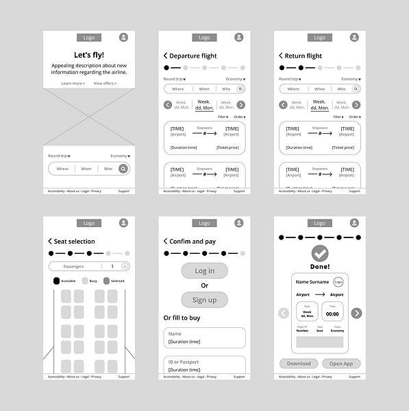
High fidelity prototype, the hi-fi prototype
Developed in Figma in mobile and desktop versions.
At this link you can see the final designs in detail and test the prototypes.

The main wireframes presented previously and their new versions in mockups .
The faces of Home


.png)
The Faces of Search
.png)


.png)
The faces of the Seat Selector
.png)


.png)
Passages

.png)
Payment
.png)
.png)
Next steps:
If this case study were an ongoing product, these would be the next steps stipulated for the project to continue moving forward.
1
Schedule
After a good response with the high-fidelity prototype tests, the project structure would be handed over to the engineers to begin the programming phase.
2
More research
Additionally, research and usability testing would be continually redone in order to continue refining the design.
3
New functions
As previously stated, new opportunities would be explored, with the aim of offering new services capable of solving users' problems, such as:
1. Flexible search mode - no set dates or destinations
2. Mileage program
3. Travel packages
4
A new cycle
Last but not least, the cycle would be restarted with the User Empathy phase, with the aim of understanding new pain points that design could address and produce solutions.
Accessibility considerations :
The Google/Coursera course has been highlighting the importance of always thinking about design with accessibility in mind since the beginning. In the case of this project, some accessibility points that stood out, and that would be addressed in more depth if the project were to continue, were:
1
a11y colors
The color palette was chosen with A11y (accessibility) color contrast standards in mind.
2
PWDs
More research needs to be done to investigate specific issues that people with disabilities may encounter with the app.
3
Languages
It is always essential to support multiple languages in an application.
In the case of this project, a good opportunity would be to map the main nationalities that would frequent the site to support their languages.
Lessons
As a psychologist and researcher, it was really cool to learn how to use skills such as listening, empathy, understanding, a sense of curiosity combined with logical reasoning and the desire to solve problems for the benefit of others in a "new" area like UX.
Therefore, I can say that this introductory course was very enriching for my introduction and learning in the UX area. In it, I learned the importance of using our knowledge for the benefit of the user, whom we are trying to help - and with that, trying to understand and comprehend them. I would say that this is the most central part of any process with people. In addition, the logic of constantly looking for points to improve and learning from mistakes made is very enriching not only for professional life, but in life as a whole.
Acknowledgements
I would first like to thank the Coursera and Google Education communities for the opportunity to take the Google UX Design Professional Certificate . I would also like to thank the Figma community for the opportunity to use the tool. In addition to these institutions, I would like to thank the research participants, Álan Belém for recommending the Google/Coursera course, and Elisa Leo Oliveira for her great mentoring and help - thank you very much!